- Light
- Light Italic
- Regular
- Italic
- Medium
- Medium Italic
- Semibold
- Semibold Italic
- Bold
- Bold Italic
- Extrabold
- Extrabold Italic
Related Collection Riant Display
- Designer
- Sibylle Hagmann
- Version
- 1
- Year published
- 2026
- Pricing
- $350.00, starting at $50.00
- Formats
- .otf, .ttf, .woff, variable
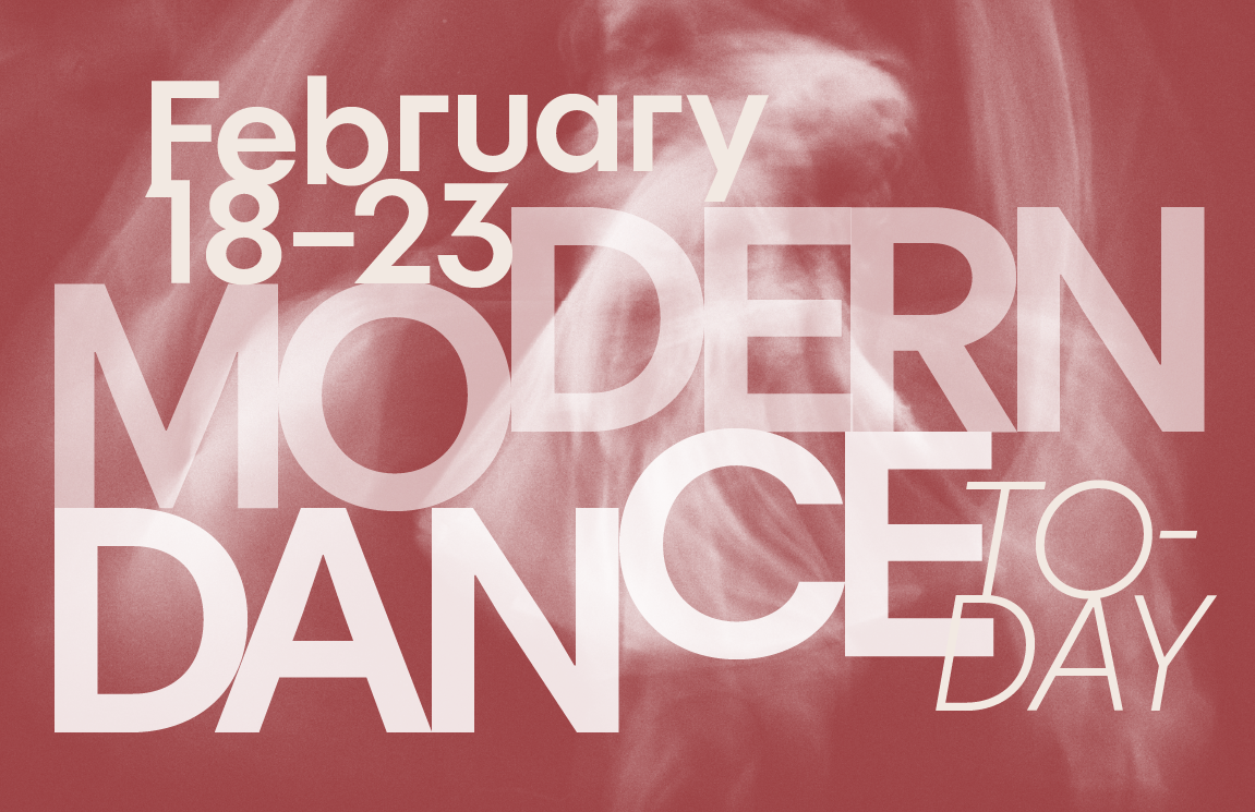
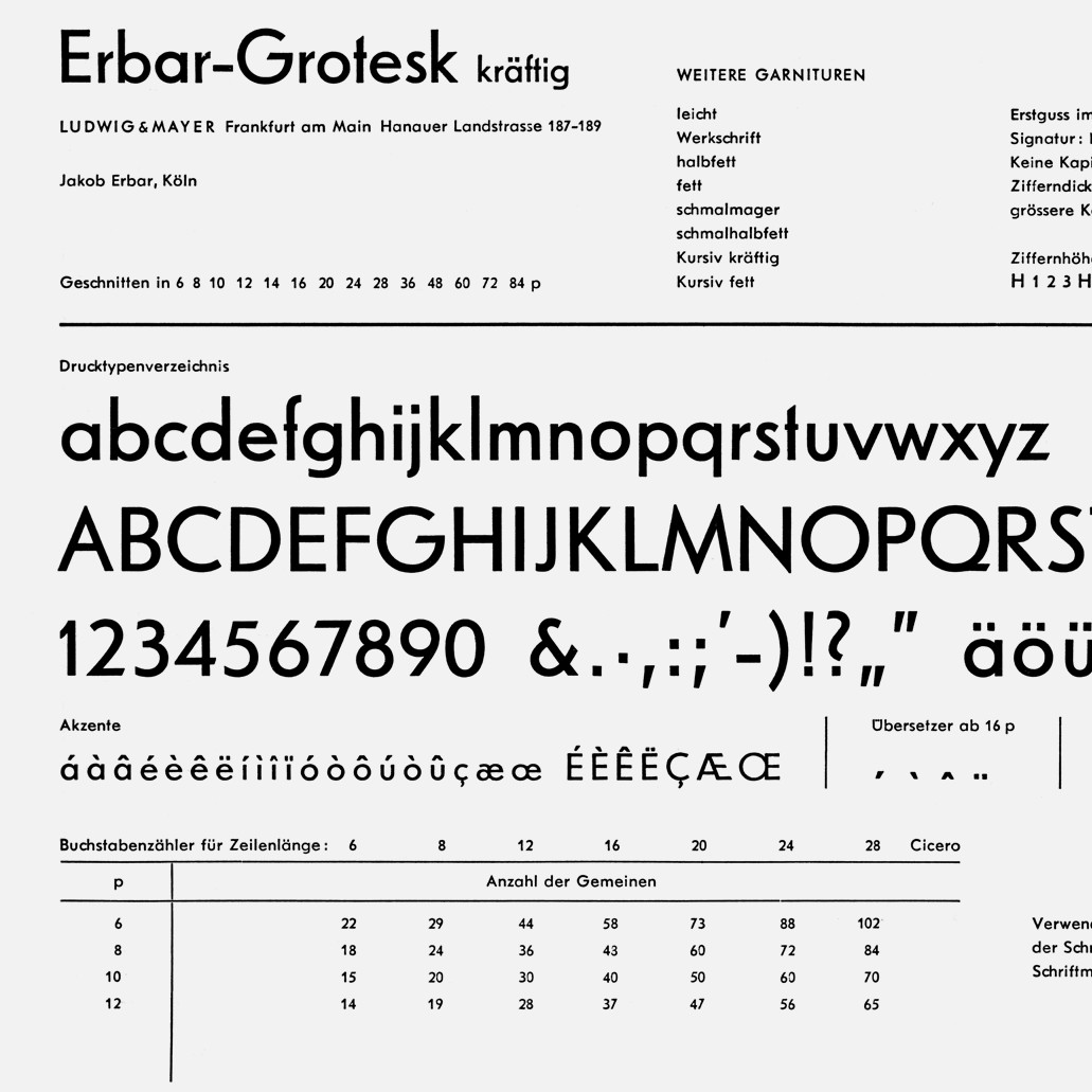
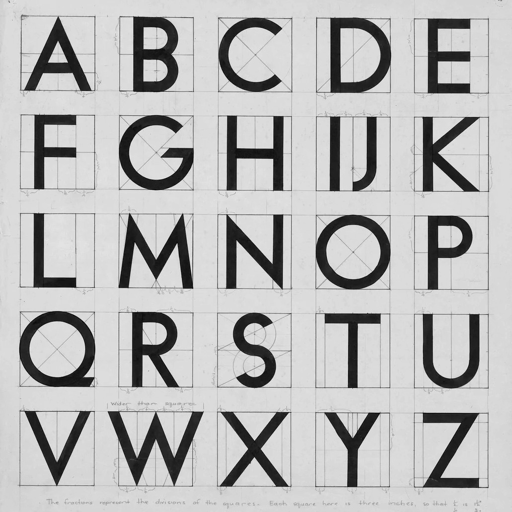
The Riant collection draws inspiration from the geometric sans serif tradition that emerged during the early twentieth century. While many geometric typefaces were developed according to rigorous mathematical systems, Riant explores the balance between constructed form and the perceptual refinements required for comfortable reading. Developed through countless iterations, the family transforms elemental geometric structures into forms suited to contemporary typography. It combines the clarity and rigor of geometric design with the optical adjustments necessary for sustained reading across print and digital media.
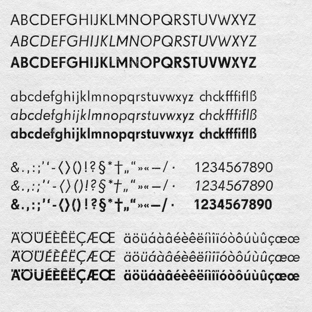
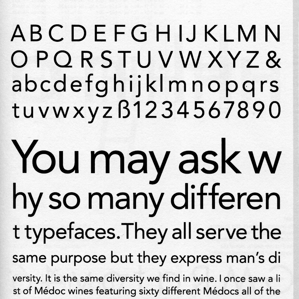
A comprehensive set of OpenType features allows users to adjust the texture and character of the typeface. Alternate forms of the lowercase a, b, d, g, p, and q introduce a softer, more rounded personality. For smaller text sizes, the default squared terminals of h, m, n, and r can be replaced with stem-to-curve junctions inspired by traditional text-type conventions. An alternate angled lowercase e offers yet another typographic voice while creating closer alignment with Riant Display. Together, Riant and Riant Display form a versatile typographic system for continuous reading and expressive display typography.
Afrikaans, Albanian, Asu, Basque, Bemba, Bena, Bosnian, Catalan, Cebuano, Chiga, Colognian, Cornish, Corsican, Croatian, Czech, Danish, Dutch, Embu, Esperanto, Estonian, Faroese, Filipino, Finnish, French, Friulian, Galician, Ganda, German, Gusii, Hungarian, Icelandic, Ido, Inari Sami, Indonesian, Interlingua, Irish, Italian, Javanese, Jju, Jola-Fonyi, Kabuverdianu, Kalaallisut, Kalenjin, Kamba, Kikuyu, Kinyarwanda, Koyra Chiini, Koyraboro Senni, Kurdish, Latvian, Lithuanian, Lojban, Low German, Lower Sorbian, Luo, Luxembourgish, Luyia, Machame, MakhuwaMeetto, Makonde, Malagasy, Malay, Maltese, Manx, Māori, Meru, Morisyen, Nigerian Pidgin, North Ndebele, Northern Sami, Northern Sotho, Norwegian Bokmål, Norwegian Nynorsk, Nyanja, Nyankole, Occitan, Oromo, Polish, Portuguese, Romanian, Romansh, Rombo, Rundi, Rwa, Samburu, Sango, Sangu, Sardinian, Scottish Gaelic, Sena, Shambala, Shona, Slovak, Slovenian, Soga, Somali, South Ndebele, Southern Sotho, Spanish, Sundanese, Swahili, Swati, Swedish, Swiss German, Taita, Taroko, Tasawaq, Teso, Tsonga, Tswana, Turkish, Turkmen, Upper Sorbian, Vunjo, Walloon, Walser, Welsh, Western Frisian, Wolof, Xhosa, Zarma, Zulu
All Roman and Italics styles include the same set of glyphs with additional stylistic alternatives.