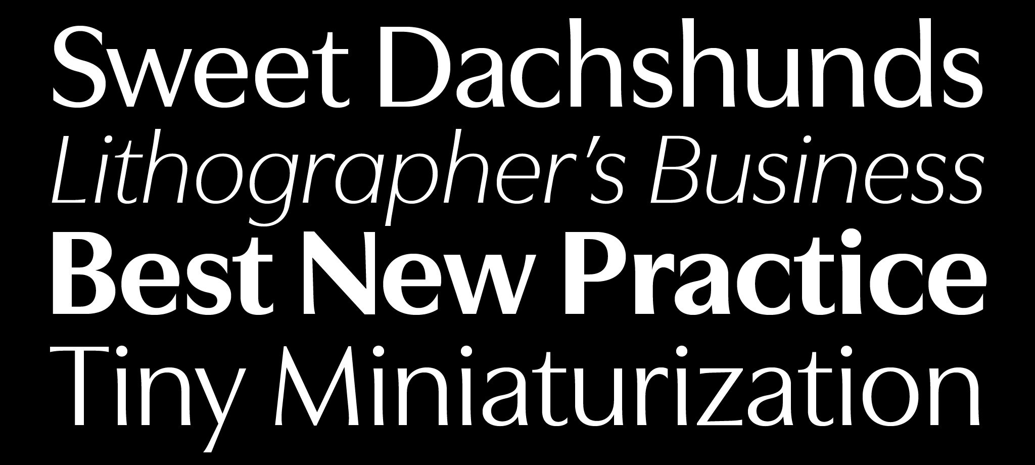
Utile Display
Utile Display Light
Utile Display Light Italic
Utile Display Book
Utile Display Book Italic
Utile Display Regular
Utile Display Regular Italic
Utile Display Medium
Utile Display Medium Italic
Utile Display Semibold
Utile Display Semibold Italic
Utile Display Bold
Utile Display Bold Italic
Utile Display Black
Utile Display Black Italic
Language Support & Font Formats
Format Options
OTF, WOFF, WOFF2, TTF. Variable fonts upon request
Designer
Sibylle Hagmann
Initial Release
2019
Language Coverage
Extended Latin
Styles
14
Version Number
v1.302
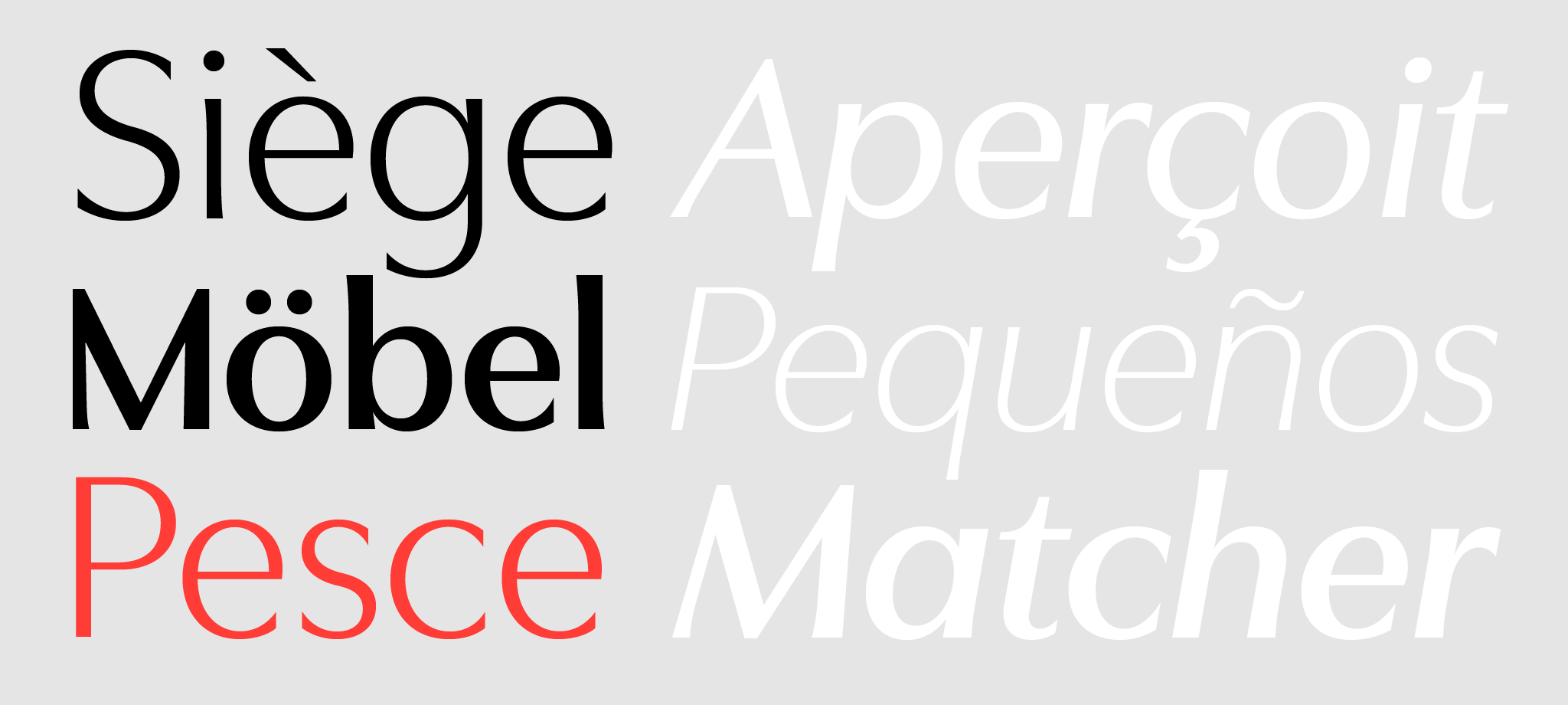
Extended Latin character set covering the following languages:
Latin 1 – 6 (ISO 8859 – 1, 2, 3, 4, 9, 10): Afrikaans, Albanian, Basque, Bosnian, Breton, Catalan, Cornish, Croatian, Czech, Danish, Dutch, English, Esperanto, Estonian, Faroese, Finnish, French, Frisian, Friulian, Gaelic (Manx), Gaelic (Scottish), Galician, German, Hawaiian, Hungarian, Icelandic, Indonesian, Irish, Irish Gaelic, Italian, Karelian, Kurdish, Latin, Leonese, Latvian, Lithuanian, Luxembourgish, Maltese, Moldavian (Latin), Norwegian, Polish, Portuguese, Rhaeto-Romanic, Romanian, Sami, Serbian (Latin), Slovak, Slovenian, Sorbian, Spanish, Swahili, Swedish, Turkish, Welsh, Walloon
All Roman and Italic weights include the same set of glyphs.
Desktop Fonts
Desktop fonts are in OpenType (.otf) format.
Webfonts
Webfonts are provided for self-hosting in .woff, .woff2, and .eot formats. All styles currently offered have been screen hinted to work in sizes 16 pixels and larger.
Mobile App Fonts
Mobile app fonts are in TrueType (.ttf) format, provided upon request.
Utile Display
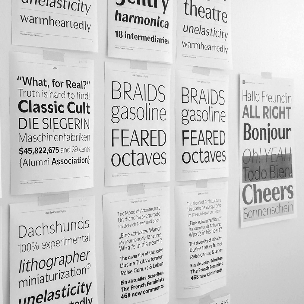
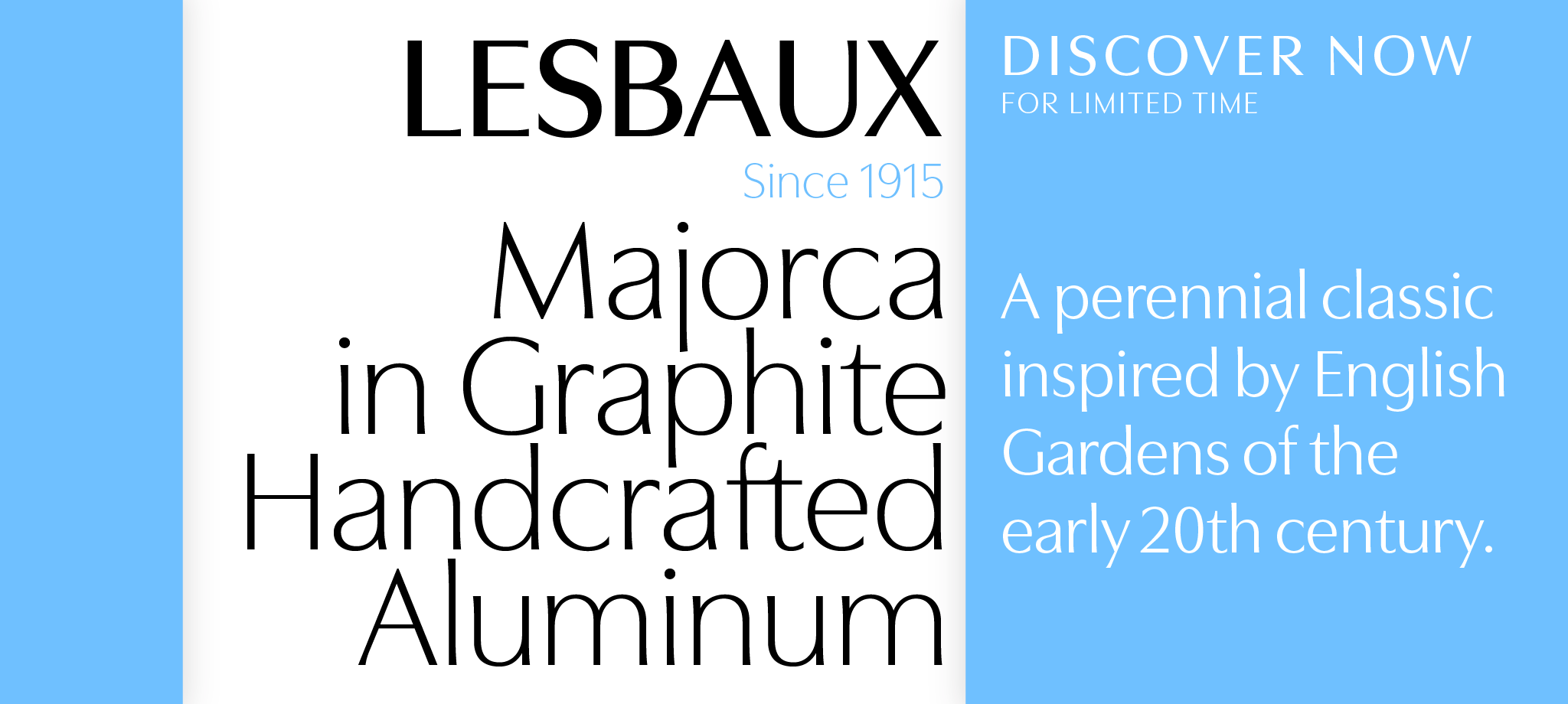
Utile and Utile Display are elegantly flared sans in two finishes suited for continuous smaller-sized text and corresponding display typography, with an overarching aim for superb legibility and optical balance. Designed with clarity and function in mind, Utile (text) features a solid letter build with carefully weighed spacing for ongoing passages of text, and form definitions compensating for trapped ink and low pixel density. Utile Display, a modulated sans, pays tribute to the contrast of thick and thin, feeling right at home in title compositions with tighter letter spacing and re-proportioned designs. The contrasted sans promotes a timeless elegance and lively aesthetic that comes especially to light in larger sizes. The slightly curved stem modulation of the Utile Collection, uniquely asymmetrical in its application, attempts to maintain a balancing act between swelled strokes and the absence of such, a feature in tune with open counters and vertical stroke ends, yielding a dynamic quality. Open Type features include figures for text and tables, stylistic alternates, fractions, and more. The ample weight scale and multipurpose variety of text and display is intended, but not limited, for contemporary identity-branding, editorial and advertising for print and screen programs.
Utile started out as an extensive study of numerous sans-serif typefaces that have their roots in the type classification of static Grotesks and Neo Grotesks. In parallel to this exploration and during the design process, divergent consideration came into play, such as maximum flat-open apertures in upper cases (C, G, S) and lower cases (c, s), a concept that was later abandoned to return to more measured apertures with moderately open humanist lower case forms to enhance the reading experience for smaller set text.
Although the concept of flat-open apertures was set aside, it provoked an exploration of stroke contrast and an addition of glyphic details that led to lightly swelled terminals for both text and display styles. The asymmetrical incised stem definitions, applied with measure, help to render the type rhythmically animated with a touch of classical letter heritage. To keep reverberations of the pen at its lowest, the majority of upper cases are then also mostly spared of glyphic details generally maintaining a sans identity. The Utile collection is reminiscent of typefaces designed during the mid 20th century enunciating a certain elegance and fluidity.